
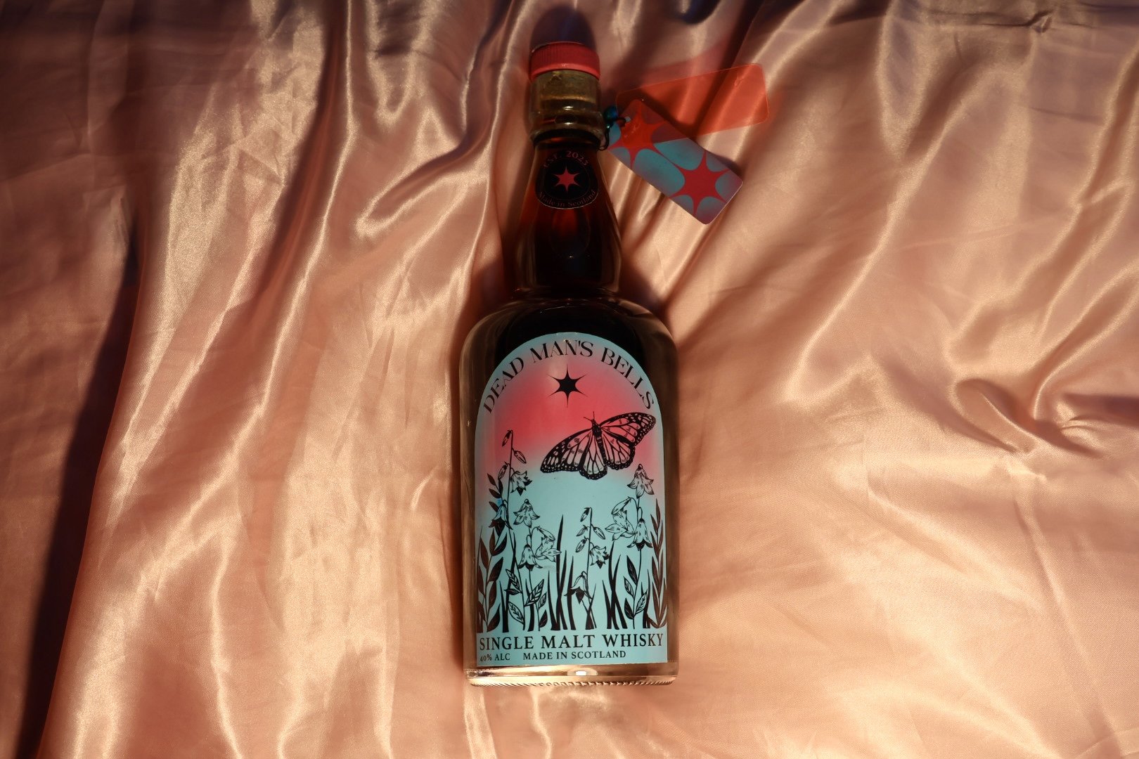
Dead Man’s Bells is a Scottish whisky brand I created to appeal to women, who are nearly 40% of whisky drinkers, despite the stereotype that it is a man’s drink. The name, Dead Man’s Bells, is inspired by the folklore behind Blue Bells in Scotland. The flowers are the meeting place of the Faeries, and if a human hears the ring, they know danger is near. This idea is incorporated into the bottle, where bells are strung around the neck. When the consumer picks it up, it rings, reminding them that alcohol can be dangerous, tying into my public health campaign.


Along with the whisky, I created a public health campaign for women who are victims of domestic violence. I had to tackle the brief of promoting a product, while also recognizing the harm it can do. In 62% of cases of domestic violence in Scotland, the perpetrator has been reported to be drinking. The stickers are made to promote the message in bathrooms of pubs and clubs around the UK, the billboards are for the general public.

